For my entire college career, I’ve been heavily involved in intramural sports, both in my undergrad studies at Cal and in my graduate studies at MIT. At Cal, I was only involved as an athlete, but at MIT I’ve been more involved on the leadership side (MIT IMs are almost entirely organized by students). Currently we’re running a competition to design the new IM champion T-shirt, and I decided to submit an entry. While I’m no expert on design (just a sometimes artist), I thought it might be useful to document my process here in case other similarly non-expert designers would find it useful for their own work. Here’s the final product, if you’re interested in seeing how I got to this point, read on:
 Before one can start with the design, you need to come up with the concept. For this design, I wanted to riff off the MIT mascot (the beaver, “nature’s engineer”) in a way that’s relevant to intramurals. I wanted a design that addressed that the T-shirt was the prize for winning a championship and that IMs are the most informal manifestation of organized sports in the college environment. The concept I came up with was a beaver holding a championship cup hewn from a log. After coming up with the concept itself, the first step in my design process was to sketch out a few different versions of it:
![]()
Ideally the sketches in this part of the process would have more variation than the ones here. I guess it worked out that they were so similar in this case because I was happy enough with my concept that I didn’t need to iterate much. I did use the sketches to block out the design, and hone down exactly how I would try to draw the beaver (which is a lot harder to draw than a cup). It also helped me nail down a few details, like the cup handles being made from twigs and the neck of the cup having a beaver-chewed pattern. After the sketches, the next step was to draw a cleaner version in ink rather than pencil:
![]()
If I was more handy with vector based image processing programs (programs like Adobe Illustrator or Inkscape), I think I could skip this step: I’d be able to make an iconic, high-contrast image entirely digitally. Since I don’t have a ton of experience with these programs, it’s much easier for me to draw an image the old school way. From the photo of the drawing, I do some post-processing (increasing the brightness and contrast so it looks as close to two tone as possible) and then feed it into autotracer.org a cool, free, online tool that “vectorizes” bitmap images. The output is something like this:
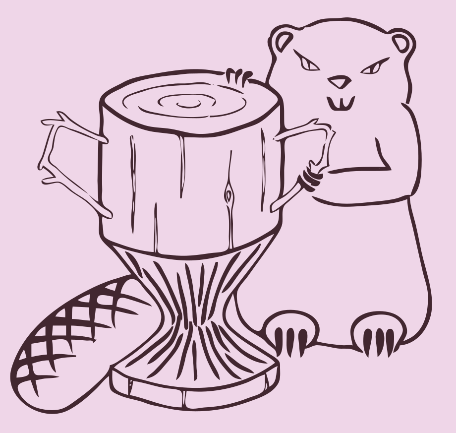
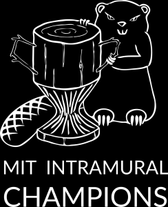
With the output from autotracer, I have a high contrast image more amenable to digital editing. For the T-shirt design, I wanted a white image and text on a black background, so some minimal editing gives the final T-shirt design:
I hope you like the design and enjoyed reading about the process, and if this inspires you to make some digital art of your own, I’d love to see it!